What Color Do Red and Green Make? A Complete Guide to Color Mixing
Ever mixed two paint colors and wondered what you’d get? Color mixing is a simple, fascinating part of art and design. A common question people ask is, “What color do red and green make?”
At first glance, red and green seem like total opposites. One reminds you of roses and sunsets. The other brings to mind forests and fresh leaves. But when these two colors come together, something interesting happens.
The result depends on how you mix the colors. Are you dealing with paints, digital screens, or light? In traditional paint mixing, combining red and green typically produces brown or a muted earthy tone. However, in light-based systems like screens, the result is completely different.
This guide explores how color mixing works. You’ll learn why red and green behave the way they do. Artists, designers, and everyday people can use this knowledge creatively.
Understanding Basic Color Theory
Before answering the big question, you need to understand how color theory works. Color theory is a set of guidelines artists use to combine colors effectively. It explains how colors interact and how we perceive them.
Think of colors like cooking ingredients. Just as flour, sugar, and butter create a cake, mixing colors produces entirely new shades. The color wheel is the main tool to visualize these relationships. It shows how colors connect and what happens when they mix.
- At its foundation, color theory helps you understand how colors interact. It guides you in choosing combinations that create harmony, contrast, and visually pleasing results.
- Which colors blend well together?
- Which ones cancel each other out?
- What happens when opposites combine?
Red and green are positioned directly across from one another on the color wheel. This makes them complementary colors with a naturally strong contrast. Before mixing pigments, it helps to understand basic color theory principles that explain how colors interact on the wheel and in practice. [1]
Primary, Secondary, and Tertiary Colors
To understand color mixing, you need to start with the basics. It is impossible to create primary colors by combining other colors. In traditional painting, these are:
- Red
- Blue
- Yellow
These colors form the foundation for all others.
Secondary colors form when two primary colors mix:
- Red + Yellow = Orange
- Blue + Yellow = Green
- Blue + Red = Purple
Tertiary colors appear when primary and secondary colors combine. This creates shades like red-orange or blue-green. Red and green, however, belong to different categories in this system. This leads to an interesting result when they mix.
What Results from Mixing Red and Green?
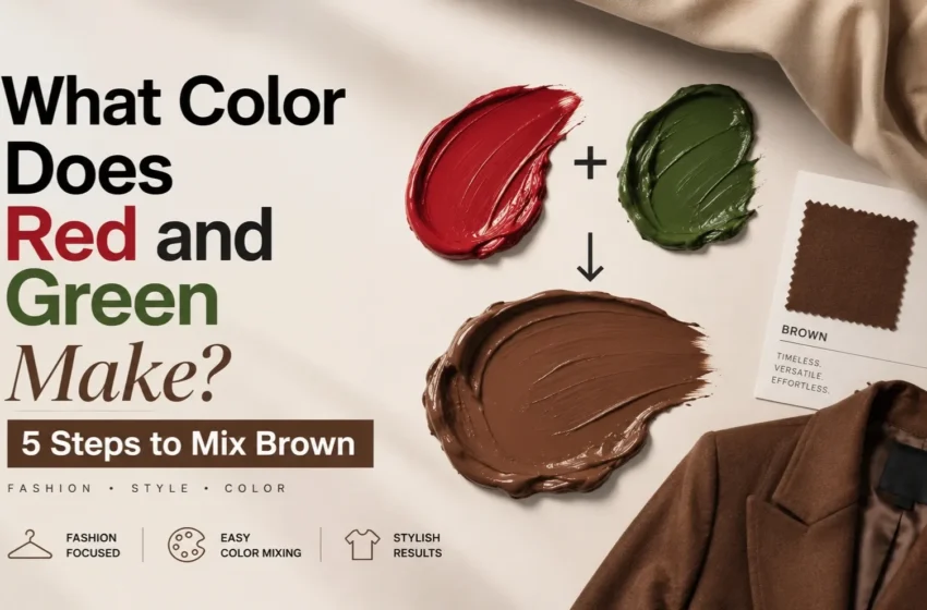
Now, let’s answer the main question. When red and green paint are mixed, the result is typically brown. But why? Because red and green are complementary colors. On the color wheel, complementary colors are placed directly across from one another. They form pairs that create strong visual contrast when combined.
When mixed together, they neutralize each other. This produces a muted tone instead of a bright one. Imagine mixing two strong flavors in cooking—like lemon and chocolate. Individually they’re powerful, but together they create a completely different taste. Colors behave in a similar way.
The final shade changes based on several factors. These include the specific tones used and how you blend the colors:
- The type of paint
- The shade of red
- The shade of green
- The mixing ratio
Sometimes the result looks muddy brown. Other times it appears more olive or earthy.
Why Red and Green Create Brown in Paint
Paint mixing works through something called subtractive color mixing. In simple terms, pigments absorb certain wavelengths of light and reflect others. When you mix paints, you combine their absorption properties.
Red paint absorbs most colors except red. Green paint absorbs most colors except green. When mixed together, the pigments absorb a large portion of the color spectrum. What remains reflected is a darker neutral color—usually brown. You can think of it like layering sunglasses. Each pair blocks more light, making everything darker. This is why mixing many paints together often leads to dull shades rather than vibrant ones.
How Light Mixing Changes the Result
Interestingly, the result changes when you mix light instead of paint. Digital screens use additive color mixing. This works differently from paint. In light-based systems, the primary colors are
- Red
- Green
- Blue
Red light and green light together give yellow light. That’s why televisions, smartphones, and computer screens can produce thousands of colors using only these three lights. So depending on the system:
- Paint mixing: red + green = brown
- Light mixing: red + green = yellow
They’re the same colors, but the rules are completely different.
The Role of Color Intensity
Not all reds and greens are equal. Some are bright and saturated, while others are soft or dull. This difference dramatically affects the final mixture. For example:
- Bright red + bright green → warm brown
- Dark red + dark green → deep earthy brown
- Light red + light green → muted beige tone
Intensity, also known as saturation, determines how vivid a color appears. Artists often adjust intensity by adding:
- White (to lighten)
- Black (to darken)
- Gray (to mute)
Understanding intensity helps create more precise shades.
Warm and Cool Variations of Red and Green
Another factor that changes the result is color temperature. Warm reds include scarlet, vermilion, and tomato red. These contain hints of yellow and produce warmer browns when mixed with green. Cool reds include crimson, burgundy, and wine red. These contain hints of blue and create deeper, richer browns.
Green also has warm and cool versions:
- Warm green: yellowish green
- Cool green: bluish green
Different combinations produce completely different earthy tones.
Using Red and Green in Art and Design
Artists frequently use red and green together because of their strong contrast. Since they are complementary colors, placing them side by side makes both colors appear more vibrant. You’ll notice this effect in:
- Holiday decorations
- Floral paintings
- Graphic design
- Fashion
However, when mixed directly, they become neutral. This makes them useful for creating natural colors, such as the following:
- Tree bark
- •Soil
- Animal fur
- Shadows
Painters often mix their own browns using red and green instead of buying brown paint. This practice is a key aspect of color in design.
Everyday Examples of Red and Green Mixing
You may not realize it, but this color combination appears everywhere. Many natural browns result from subtle blends of red and green tones. Examples include:
- Tree trunks
- Leaves changing color
- •Earth and clay
Some foods visually resemble red-green mixtures:
- Certain sauces
- Roasted vegetables
- Chocolate-based desserts
Designers use muted tones created from complementary colors to produce cozy spaces. These earthy colors feel calm and natural. Consider your everyday color choices and how they impact your environment.
Common Mistakes When Mixing Colors
Many beginners struggle with color mixing because of a few common mistakes:
- Adding Too Much Paint: Using too much of one color overpowers the mixture. Start with small amounts and adjust gradually.
- Using Dirty Brushes: Leftover paint unintentionally alters the color. Always clean brushes before mixing.
- Mixing Too Many Colors: Combining several colors often results in muddy tones. Stick to two or three pigments for clearer results.
Learning these simple habits dramatically improves color mixing results.
Tips for Creating the Perfect Brown Tone
If you want to create beautiful browns using red and green, try these tips:
- Start with equal parts. This produces a balanced neutral tone.
- Adjust gradually. Add small amounts to change warmth or darkness.
- Experiment with shades. Different reds and greens create unique results.
- Add white for lighter tones. This produces tan or beige shades.
- Add blue for deeper tones. This creates cooler earthy colors.
Think of color mixing like cooking soup—small adjustments make a big difference.
The Science Behind Color Perception
Your eyes and brain also play a role in how you see mixed colors. The human eye contains cells called cones that detect different wavelengths of light. These cells respond mainly to:
- Red light
- Green light
- Blue light
Your brain interprets signals from these cells to produce the colors you see. That’s why lighting conditions change how a mixed color appears. A brown mixture looks warmer in sunlight and cooler under artificial light. Color perception is part science, part psychology. For more visual learning resources, explore how different elements influence perception.
FAQs
What color do red and green paint make?
Red and green paint typically mix to create brown or an earthy neutral shade.
Why do red and green create brown instead of another bright color?
Because they are complementary colors, their pigments absorb most wavelengths of light when combined, leaving a neutral tone.
What color do red and green light make?
In light-based systems like screens, red and green combine to produce yellow.
Can red and green make different shades of brown?
Yes. The exact shade depends on the specific tones and the mixing ratio of the colors used.
Is mixing complementary colors always a good idea?
Yes, especially for creating neutral tones, shadows, and natural-looking colors in artwork.
Conclusion
So, what color do red and green make? In most cases—especially with paints and pigments—the answer is brown. This happens because red and green are complementary colors that neutralize each other when mixed. However, the result varies depending on factors like shade, intensity, and mixing method. When dealing with light instead of paint, the same combination produces yellow.
Understanding these differences opens the door to more creative possibilities. Whether you’re painting, designing, decorating, or simply experimenting, knowing how colors interact transforms how you see the world. Color mixing is a bit like storytelling—each combination creates a new character, mood, or atmosphere. Sometimes, the most surprising results come from pairing opposites.